Call for speakers application closes soon!
00
DAY
00
HR
00
MIN
00
SEC

View our top 10 finalists in the 2026 Data Viz Competition.
Vote now to send the top 5 to the DataConnect Conference on October 29th & 30th!
By
Antoniea Hylton
Decision Scientist
at
AdVon Commerce
from
Dublin, OH
I created this visualization as a personal storytelling project focused on my journey paying off private student loan and credit card debt after graduate school. As an international student from The Bahamas, I pursued higher education in the U.S., but did not come from an affluent background. I used the loan to pay tuition and my credit cards to buy food, books, and other supplies.My dashboard was built using transactional data compiled from my private loan statements, credit card records, and a small supporting dataset from Experian. My goal was to make the financial journey easy to understand while still visually engaging and emotionally impactful. I used a time-series chart to show progression over time and make trends immediately visible. Bar charts were used because they make comparisons easy to interpret at a glance. Grouped bar charts like the generational debt comparison were effective for comparing multiple categories across different years simultaneously. Stacked visuals helped communicate composition and relationships between debts rather than showing isolated values.Through my analysis, I uncovered a nearly $2,000 discrepancy between what I originally believed I had repaid and the actual repayment amount once interest payments were fully accounted for. One of the most surprising insights came after researching debt payoff strategies. I realized I had unintentionally followed the avalanche method, prioritizing high-interest debt first. Comparing that approach against making only minimum payments revealed just how much time and money I ultimately saved by choosing to attack my debt aggressively.
By
Seungwon Jeong
Analyst
at
Independent Data Analyst
from
Chicago, Illinois
"Run Smarter, Not Harder" is an interactive HTML dashboard that explores how recovery status and training load quietly shape running economy. It uses 1,332 anonymized training sessions from 4 athletes, collected through ONWRD, a fitness mobile app I built. Data was prepared using SQL for querying and Python for statistical analysis and feature engineering. The visualization uncovers a Simpson's Paradox: overreaching training looks harmless on the surface, but splitting by recovery level reveals a 128% swing in running efficiency. Fatigued athletes drop to −0.059, while recovered athletes jump to +0.069 from the same hard workout.The dashboard walks viewers through eight chapters, building toward the central discovery through statistical testing (Kruskal-Wallis H=15.135, p=0.0017). The hero visualization is a color-coded heatmap mapping 12 combinations of recovery zone and training status, making it clear that recovery gates whether pushing hard helps or hurts.Every comparison uses within-subject deviation analysis, so differences between athletes don't distort the story. Each claim is paired with sample sizes and confidence levels. An interactive athlete selector lets viewers see how recovery sensitivity varies up to 6.7× across individuals, turning a group level finding into something personally actionable.All user data is de-identified with simple labels (A1 through A4). The whole thing is a single HTML file powered by Chart.js, so there's no server or installation needed. Just open it in a browser. I wanted to show that a compelling data story doesn't require heavy tools, just good data and a clear narrative.
By
Rajendra Choudhary
Sr. Business Intelligence Engineer
at
Amazon
from
Bangalore, Karnataka, India
She Displaced is a 7-chapter scrollytelling narrative mapping where climate hazards intersect with systemic gender inequality. Analyzing 159 countries over two decades (2006–2025), the dashboard fuses ND-GAIN (vulnerability/readiness), WEF Global Gender Gap, and EM-DAT disaster records into an original composite index: the She Displacement Risk Score (SDRS).Technically, the entry is a custom-built D3.js v7 application on Vite, utilizing TopoJSON mapping and HTML5 Canvas for high-performance particle animation. A client-side engine allows for on-demand SDRS reweighting. Every visualization is purpose-fit: a bivariate world map for hidden risks, a slope chart for rank-shift analysis under gender constraints, and a log-scale matrix surfacing "Silent Crises"—years where low mortality masks massive, gendered displacement.My design philosophy was "test, don’t trust." The Innovation Lab features live sliders for reweighting index components, transforming the dashboard from a static report into a transparent sensitivity-testing tool. A constrained palette ensures structural patterns—not visual noise—take center stage.The core insight is that gender equity is a measurable climate adaptation strategy. Using Rwanda as a benchmark, the data reveals that high physical vulnerability is offset by progressive gender policy. This proves the SDRS is not just a risk map; it is a policy roadmap showing that the most effective climate investment is often social and political, not just infrastructural.
By
Kim Ly Scott
Data Visualisation Analyst
at
REA Group
from
Melbourne, VIC, Australia
My viz 'Sunday Dinners' explores the link between food and memory. In particular, I wanted to draw on my love of Cambodian cuisine, weaving in the childhood memories it evokes for me - the sounds, the tastes, the smells, the feelings. The viz focuses on the human side of food. When I was researching this topic, I came across countless stories of people who had certain foods that took them back to their childhood. I used shades of green as the main colour palette for the viz - green being a very predominant colour in Cambodian dishes. I also opted to hand draw images of my favourite Cambodian dishes and ingredients to add warmth, personality and a connection that feels more like a personal memory than a photograph.My hope is that, as people explore my viz, they too think about what foods creates these feelings of nostalgia for them.
By
Lily Eliason
Student
at
Brigham Young University
from
Provo, Utah
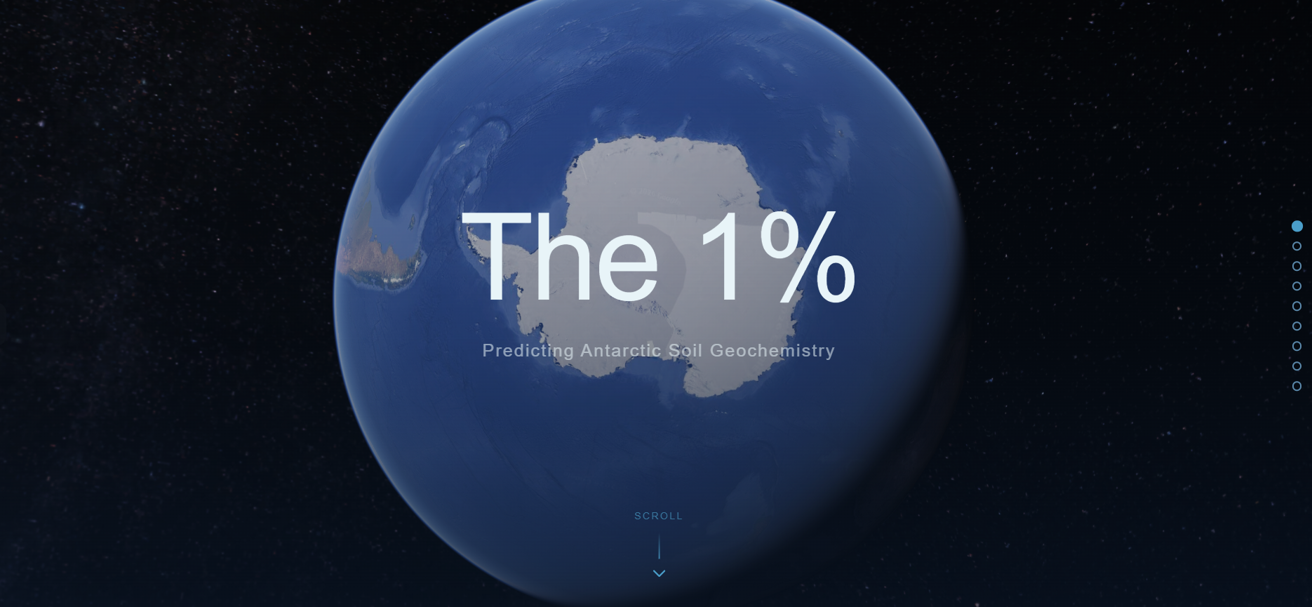
"The 1%" is a scrollytelling data visualization that translates my ongoing Antarctic soil geochemistry research into an accessible public narrative. The central design challenge was communicating a technically dense scientific problem without losing a general audience in the process.The piece is structured as a stakes-first emotional arc: establishing why Antarctic soils matter, building the case for why comprehensive sampling is impossible, then revealing machine learning as the solution before opening into the results. Scientific depth is reserved for an optional "Dig Deeper" panel that updates contextually by scene, keeping the main narrative uncluttered while rewarding curious viewers.Built in vanilla HTML, CSS, and JavaScript using D3.js and Scrollama, the visualization uses scrolling to control beat-by-beat content, revealed across eight scenes. I wanted a clean, and scientific feel for the visuals so that the research and academic tone could shine through. Each scene and transition was designed to feel intentional using colors, shapes, overlays, and text layers fading independently to create visual continuity. The interactive prediction map in the results section uses property-specific color scales: a diverging red-white-blue scale for nitrogen isotopes (where the midpoint is scientifically meaningful) and perceptually uniform viridis colormaps for the remaining properties, chosen for colorblind accessibility.The predictions reveal ecologically interpretable spatial patterns that are visually striking precisely because they reflect real underlying science rather than arbitrary model outputs.
By
Alicja Kot
Designer
at
studio2wx
from
Gdańsk, pomorskie, Poland
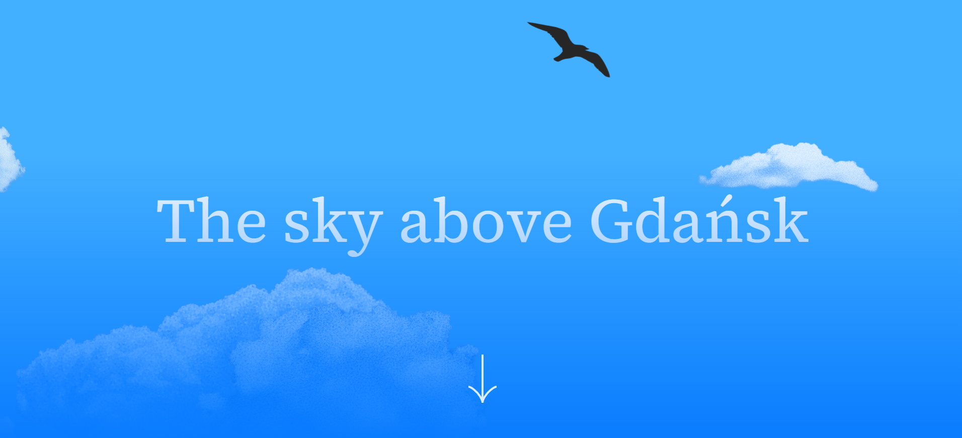
The Sky Above Gdańsk is a scrollytelling experience about the birds that share the city with us: why they chose it, and what it takes for them to thrive here.The website is designed to unfold gradually, drawing the viewer in rather than presenting information all at once. The data featured is always in the service of the narrative, which moves both literally and metaphorically top-down: from species diversity, population trends and nesting sites, to the impact of building renovations, and specific local initiatives supporting bird life in the city.One of the central design decisions was to resist the obvious visual approach. Rather than building the color palette around the birds themselves, I wanted the UI to evoke the environment they inhabit: the sky. The result is an aesthetic that – I hope – feels immersive and atmospheric, where color and visual language work together to place the viewer up there with the birds, rather than simply presenting them as subjects to observe.I designed this project in Figma and developed it using Claude Code, as part of a data visualization course I was doing. I wanted it to reflect my belief that public data about the natural world deserves more than a chart and a caption. When the design is right, it doesn't just inform: it makes you feel something, and I hope The sky above Gdańsk accomplishes that.
By
Antoinette Darpoh
Student
at
Mount Holyoke College
from
South Hadley, MA
The Travel Paradox is an interactive scrollytelling visualization that audits 560 travel destinations across 154 countries to explore the relationship between culture, climate, affordability, and experiential value.Built using Shorthand, Plotly.js, D3.js, and Scrollamation, the project combines geographic visualization, bubble plots, parallel coordinates, radar charts, correlation heatmaps, and climate analysis into a cohesive editorial-style narrative experience. The visualization investigates a central question: does higher travel cost consistently correspond to richer experiences?The project uses progressive scrolling interactions to guide readers through multiple layers of analysis. A rotating globe introduces the geographic scale of the dataset, while interactive charts reveal how destinations differ across dimensions such as culture, cuisine, nightlife, nature, seclusion, and climate comfort. The final sections personalize the analysis through a “Travel DNA Audit” that matches destinations to different traveler personas.A major design goal was balancing analytical depth with accessibility. I used a consistent regional color system, dark editorial-inspired visual styling, and narrative scaffolding text to help readers interpret more complex charts such as parallel coordinates and radar comparisons.One of the most significant insights revealed by the project is that meaningful cultural and experiential value exists across a much broader geographic and economic range than conventional travel narratives often emphasize. Rather than ranking destinations, the visualization encourages readers to think more critically about what kinds of experiences they truly value when they travel.
By
Masaki Kubota
Data Scientist
at
Astellas Pharma Inc.
from
Chūō-ku, Tokyo, Japan
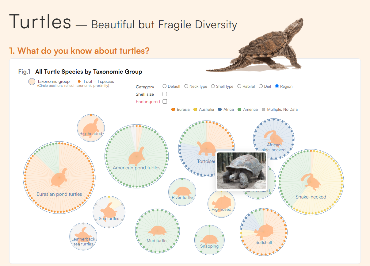
I keep turtles and am fascinated by their diversity, yet concerned about how fragile it is. I created this turtle-themed visualization to encourage more people to care about protecting biodiversity. The design techniques I used are outlined below.Using D3.js, I moved beyond standard templates by designing custom visuals and using animation to support smooth comprehension. Because my visualization is information-dense, the initial view is intentionally limited, with additional details revealed through mouse interactions (hover/click). I also tuned color saturation, brightness, and transparency to reduce cognitive fatigue. Across figures, I used a circle-based design language inspired by a turtle’s shell.For Fig. 1, I adopted a fireworks motif to convey the beauty of biodiversity. Instead of a simple pie chart, each species is plotted radially, enabling rich per-species detail. This layout also supports category views that show not only proportions but also which species belong to each category. To evoke “living” elements, the circles gently drift, while hovering pauses the motion for usability.I adjusted transition speeds (e.g., changes in color and position) so most animations unfold gradually and feel comfortable to follow; in contrast, Fig. 2A uses faster transitions to strengthen its message. Fig. 2A and Fig. 3 use less familiar chart forms to spark curiosity, but I carefully curated the displayed information and used tooltips to prevent novelty from becoming a barrier. From a storytelling perspective, I conclude with actions readers can start from everyday life.
By
Margie Verduzco
Freelance
at
Freelance
from
Tampico, Tamaulipas, Mexico
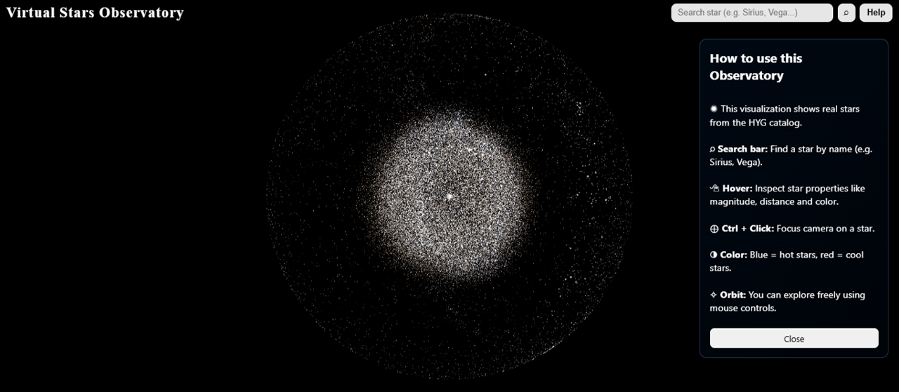
This project, Virtual Stars Observatory, is an interactive 3D visualization built using real data from the HYG stellar catalog. The idea behind it was simple, instead of looking at stars as rows in a dataset, I wanted people to feel what that data represents by exploring a living, navigable universe. Each star is positioned in 3D space using astronomical coordinates, creating a spatial map of our stellar neighborhood. I used visual encodings to make the data intuitive: brightness is represented through point size (based on magnitude), and color is derived from estimated temperature using a physically inspired blue-to-red gradient. This lets users immediately sense which stars are hotter, cooler, brighter, or farther away without reading a single number. The interaction was designed to encourage curiosity. Users can freely orbit the sky, hover over stars to reveal detailed information, or search for specific ones. I also added a focus feature so the camera can travel to a selected star, making exploration feel more personal and immersive. For this project, I used Three.js with custom shaders to render a dense point cloud efficiently, along with raycasting for precise hover selection. Log scaling helped compress vast distances so the structure of the galaxy remains visible and readable. The goal was not just to show stars, but to make people realize how structured and vast our universe actually is in a way that feels intuitive and engaging.
By
Sumaiya Shrabony
Technical Program Manager
at
University of Colorado Denver
from
Englewood, Colorado
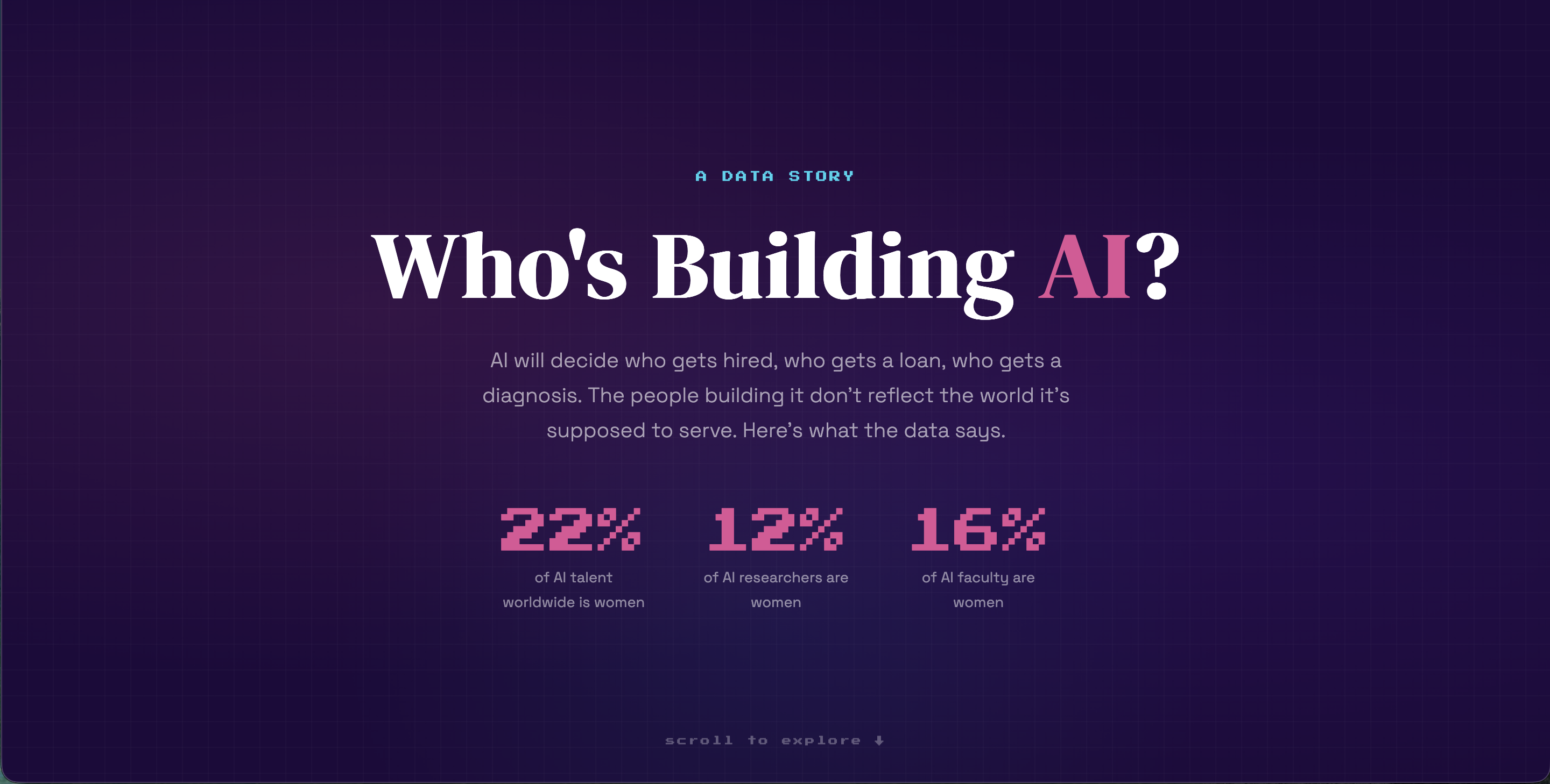
Nowadays AI decides who gets hired, who gets a loan, who gets diagnosed. The people building it don't look like the world it's meant to serve.
This is a single-page interactive visualization built as a scrollable data story using HTML, CSS, and Chart.js. I chose an editorial format over a traditional dashboard because the data has a narrative arc that a grid of charts would flatten. Each section builds on the last. You start with three numbers. Then you watch them get worse.
Five sections tell the story using verified data from eight published sources: Stanford HAI AI Index (2021, 2026), WEF/LinkedIn (2025), Deloitte (2024), ILO-NASK (2025), Lean In/Wired Research (March 2026), McKinsey (2025), OECD.AI/LinkedIn, and U.S. Census Bureau.
The pipeline funnel uses proportional horizontal bars showing the 23-point drop from STEM graduates (35%) to AI researchers (12%). The ILO exposure chart reveals women face nearly 3x the AI automation risk. The Lean In recognition gap, the finding I built the piece around, shows women and men use AI at similar rates but men are 50% more likely to be praised for it. Same behavior, different credit.
Design choices were deliberate: serif headlines for editorial authority, a restrained single-accent palette, no gradients, no animations. The dot array at the end (12 filled, 88 empty) makes the 12% stat physical. Every number links to its source.
The gap is real. It's also closing. 74 of 75 economies moved in the right direction.